2.2.3 FloatingActionButton的使用
它是一个负责显示界面基本操作的圆形按钮。其使用起来非常便捷,可以把它当作一个Button,代码如下所示:
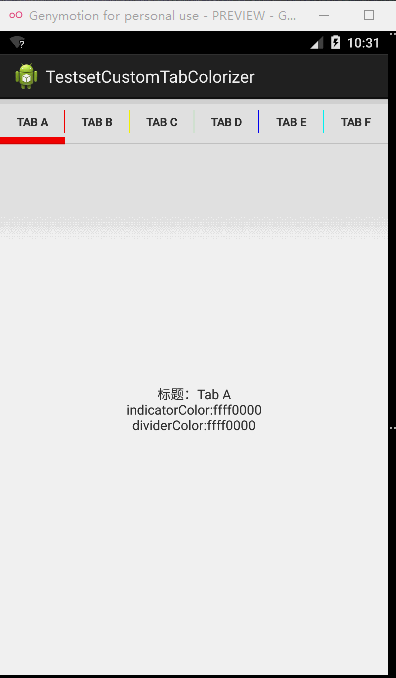
由于父布局是RelativeLayout,所以这里用了layout_alignParentBottom和layout_alignParentRight两个属性。FloatingActionButton的填充色默认也是style.xml文件colorAccent设定的颜色,当然也可以通过app:backgroundTint来设定背景填充色。app:elevation用来设置正常状态的阴影大小,app:pressedTranslationZ用来设置点击时阴影的大小,效果如图2-15所示。
图2-15 FloatingActionButton的使用
2.2.4用TabLayout实现类似网易选项卡的动态滑动效果
此前我们要实现类似网易选项卡的动态效果稍微有些麻烦,还需要动态地加载布局等技术,控制滑动的时候还需要用 HorizontalScrollView。这一次 Design Support Library给我们带来了TabLayout,故此可以很轻松地实现这一效果。本节我们就来学习一下如何用TabLayout来实现类似网易选项卡的动态滑动效果。
1.配置build.gradle
这里要配置build.gradle,如下所示:
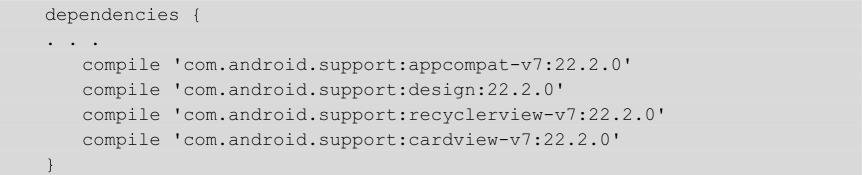
在这个例子中需要使用recyclerview和cardview,所以这里引用了com.android.support:recyclerview和com.android.support:cardview。
2.主界面的布局
下面看看主界面的布局是怎样的,代码如下所示:
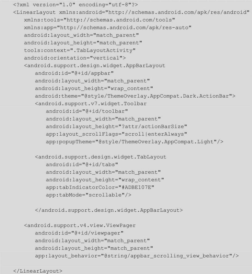
这里用到了AppBarLayout和Toolbar,AppBarLayout是Android Design Support Library新加的控件,继承自LinearLayout,它用来将Toolbar和TabLayout组合起来作为一个整体。Toolbar在第 1章我们已经讲过了,这里就不做介绍了。该布局文件最关键的一点就是android.support.design.widget.TabLayout标签中的app:tabMode=”scrollable”,其设置Tab的模式为可滑动的”。另外还可以设置 app:tabMode=”fixed”,表示固定不可滑动的。如果我们将app:tabMode这一属性去掉,或者设置app:tabMode=”fixed”,运行程序就会如图2-16所示。Tab的数量太多了(13个),由于不能够滑动,所以选项就会彼此压缩,这样的效果显然是不行的。我们设置app:tabMode=”scrollable”来看看效果,如图2-17所示。这样Tab的样式就正常了,而且还能够滑动。

图2-16压缩的Tab选项

图2-17正常的Tab选项
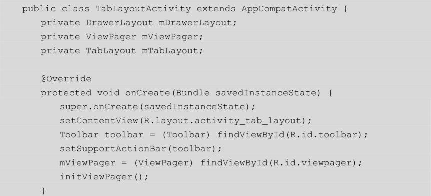
3.Java代码
接下来我们在Activity中引用这个布局文件。
initViewPager()方法的代码如下所示:
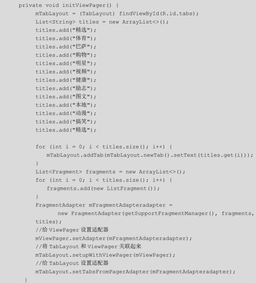
在这里我们设定了13个标题内容并创建了相应的TabLayout和Fragment,设置了ViewPager适配器和TabLayout适配器,并将TabLayout和ViewPager关联起来。这里我们用自己创建的ListFragment作为每个Tab的界面,接下来看看ListFragment是如何定义的,代码如下所示:
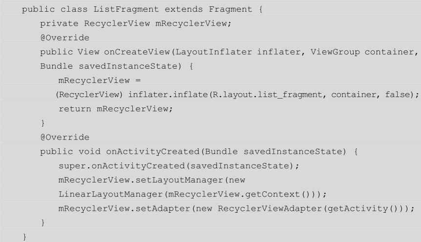
这里用RecyclerView来代替ListView,来看看RecyclerViewAdapter的代码。
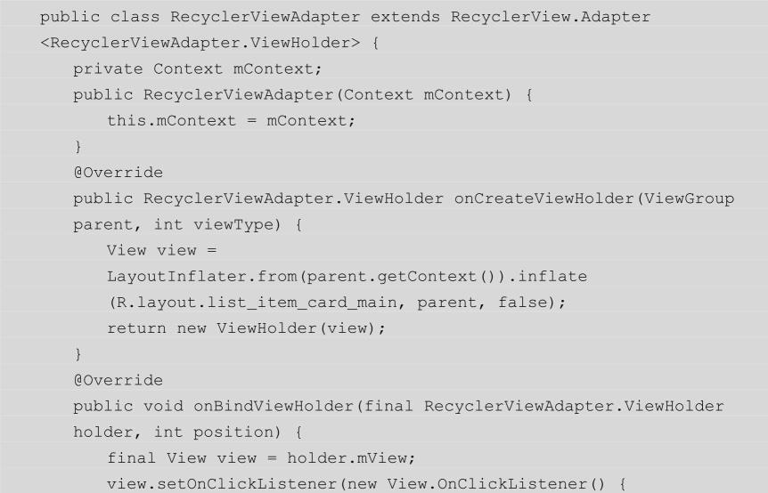
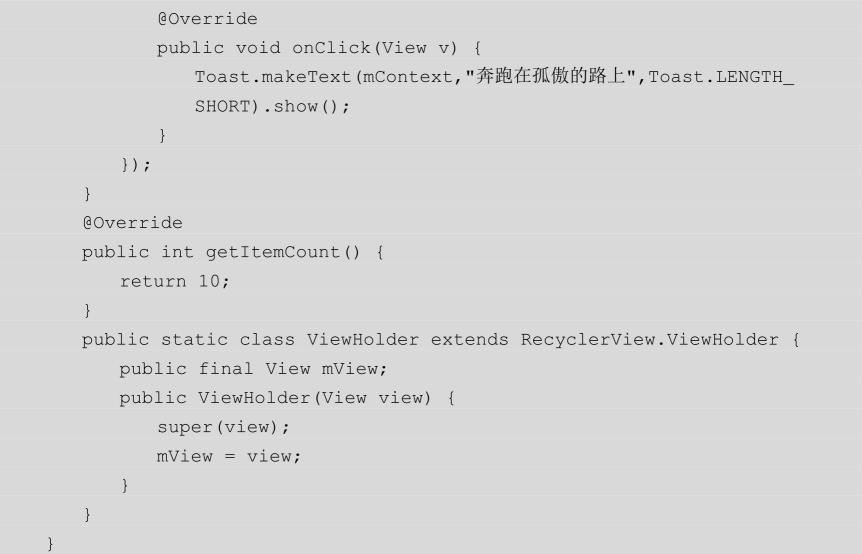
在代码中为item选项设置了点击事件响应,并将item条目数设置为10个。最后来看看FragmentAdapter的代码。
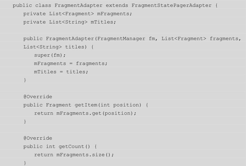
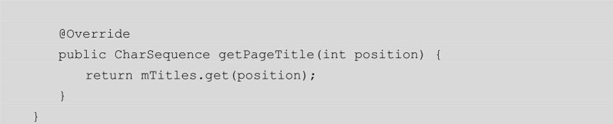
FragmentAdapter主要处理了两件事:一件事就是根据不同的 position来返回不同的Fragment;另一件事就是根据不同的position来返回不同的title。基本所有的代码都讲到了,当然这种稍微复杂的效果TabLayout能够实现,那简单的3、4个Tab滑动,TabLayout实现起来就更不在话下了。修改TabLayoutActivity的initViewPager方法,代码如下所示:
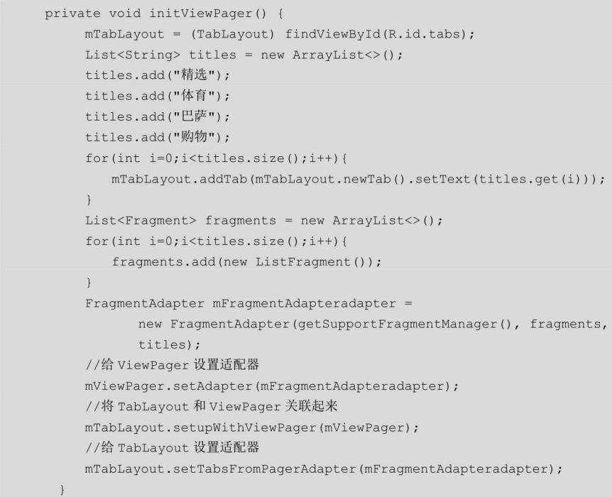
我们只保留了4个Tab,然后设置app:tabMode=”fixed”,运行代码来看看效果,如图2-18所示。如果觉得底部指示器不符合心意,还可以用tabIndicatorHeight来设置底部指示器的高度,用tabIndicatorColor来设置底部指示器的颜色等。

图2-18 4个Tab选项